In addition to reports and Dashboards, Marin also offers charts that allow you to visualize your data, including comparison metrics, to create data-rich dashboard widgets.
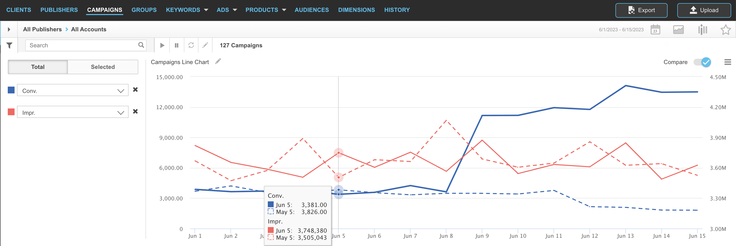
Charts are interactive -- simply hover over your chart to gain additional, in-depth insight into the data that interests you most -- and are available on most tabs.
Additionally, charts can be added to Saved Views and Dashboards in order to add a visual element to your data analysis and help you understand your overall performance, both from a high level or for drilled-down analysis.
Ready to get started using charts?
Types Of Charts
We offer six different types of charts.
- Line

Line charts help you visualize trends in a metric over time.
Example: conversions, revenue, clicks, or any other metric whose performance you want to trace over time. - Bar

Bar charts, similar to line charts, help you visualize trends over time and can help you compare different groupings of objects.
Example: conversions, revenue, clicks, or any other metric whose performance you want to trace over time; Track different groupings using Dimensions combined with a bar chart. - Scatter

Scatter charts can help you visualize the relationship between two metrics and find correlations.
Example: Clicks vs. Conversions - Bubble

Bubble charts are similar to scatter charts, but also allow for plotting a third metric (bubble size) to bring more visual attention to important data points.
Example: Clicks vs. Conversions vs. Publisher Cost, with Publisher Cost indicated by the size of the bubble. - Pie

Pie charts allow for comparisons on one metric across a few items.
Example: Conversions by Strategy or Publisher Cost by Publisher - Line Bar

Line Bar charts allow you to plot several different metrics against one another in two different visual formats for easy comparison. This can be useful when you want to track the correlation between two metrics.
Example: Clicks vs. Conversions, with one metric represented by the line chart and the second metric represented by the bar chart. - Stacked Bar

Stacked Bar charts allow you to plot up to five metrics stacked on top of one another. Select your objects first, click ts, choose Selected, and you'll see metrics stacked for easy comparison for the selected objects.
Example: Compare several different conversion types up against one another, split out by the selected campaign.
How To Use Charts
See It In Action
Watch the video below to see how to add charts to the grid, adjust the visible data, and toggle between the available types of charts.
Note: This video does not contain audio.
Adding Charts To The Grid
- The first step, as always, is to log into Marin.
- Next, select either Search or Social from the left-hand navigation. Charts are available in both locations.
- From here, navigate to the desired tab. Charts are available on all tabs, including all object levels, Dimensions, devices, history, and more.
- Once you're on the desired tab, apply any filters, date ranges, or columns needed. Keep in mind that your chart will respect these selections by default, but you can always adjust these later on if needed.
- Next, launch charts by clicking on the Charts button ('graph' icon) in the top right-hand corner, above the grid.

- Next, you can toggle between the Total chart or the Selected chart.

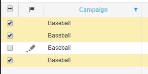
- The Total chart shows you totals for all objects in your grid, respecting any filters that you've applied. For example, if you've applied a filter to view only your Baseball campaigns, the Total chart will show you metric totals for the filtered campaigns.
- If you toggle to the Selected chart, you can select the check-box next to specific objects and chart those up against one another for a single metric. You can select up to 12 rows for your chart.
- You can individually remove selected objects from your chart by clicking the X icon next to the corresponding object.
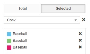
- If you make changes to your selected objects, you can refresh your Selected chart by clicking the Refresh Chart button.

- For both the Total chart and the Selected charts, you can adjust the chart metrics from the drop-downs by browsing through the list or by typing in the name of your desired column and selecting the closest match. You can also click the X icon to remove a metric entirely.

- You can turn on comparison metrics from the Compare toggle on the right-hand side. If your Compare toggle is turned on, it will display green. If it's turned off, it will display in gray.

When turned on, your comparison metrics will display within the chart using a dashed line, while your primary metrics will display with a solid line.
Note: Comparison metrics are only available for line charts.
- To adjust the chart type, click on the Hamburger menu on the right-hand side.
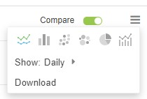
- You can re-name your chart by clicking on the pencil icon to the top-left of your chart. If you choose to download your chart, it will take this name by default, but you will have a chance to re-name it prior to kicking off your download. We'll talk more about this in the next step.

- To download your chart, click the Hamburger menu and select Download.
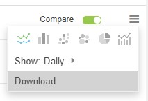
- Also from the Hamburger menu, you can adjust which data is visible. Search charts currently show daily data, but Social charts show daily, weekly, and monthly data. For certain charts (line, bar, and line-bar), quarterly data is also available.
- You will have the option to download your chart as a JPG, PNG, or PDF. You also have the option to adjust the height and width of your chart based on your own needs.
If you did not already re-name your chart, you will have the option to do so prior to download.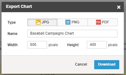
- Once you set your chart to your liking, simply hover over it to gain additional, in-depth details about the data that interests you most.
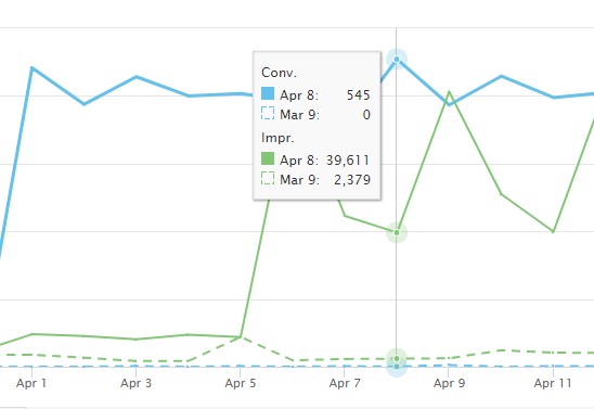
- To close/hide your charts, simply click the Charts button ('graph' icon) once more. This returns you to your data grid, without the visual representation of your charts.

- That's all there is to it!
Adding Charts To Saved Views
To add a chart to a Saved View, simply create your Saved View as normal, no additional action is needed. When you load your Saved View, you can then turn the charting capabilities on or off as needed. It is not required for the charting capabilities to be turned on at the time your view is saved in order to use charts in your Saved Views.
To learn more about creating Saved Views in Marin, check out our dedicated article.

Adding Charts To Dashboards
To add a chart to a Dashboard, when you add a new widget, simply select the Add Chart option.
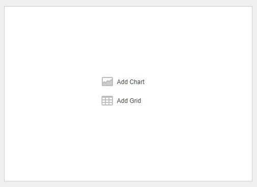
Dashboards are built from Saved Views, but it is not required for the charting capabilities to be turned on at the time your view is saved in order to use charts in your Dashboards.
As with using charts in the grid, Dashboard charts are interactive -- simply hover over the chart to gain additional, in-depth details about the data that interests you most.
To learn more about creating Dashboards in Marin, check out our dedicated article.
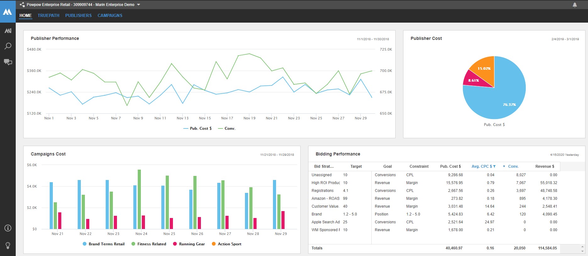
Using Charts With Reporting
Charts cannot currently be added to CSV or Web Query reports, but you can download a PNG or PDF of your chart and add it to your report as needed.